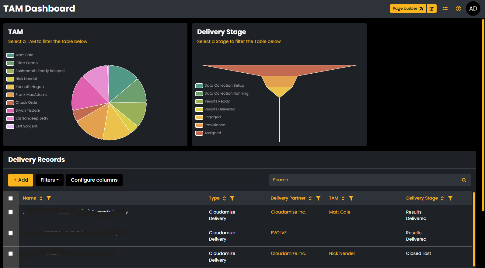
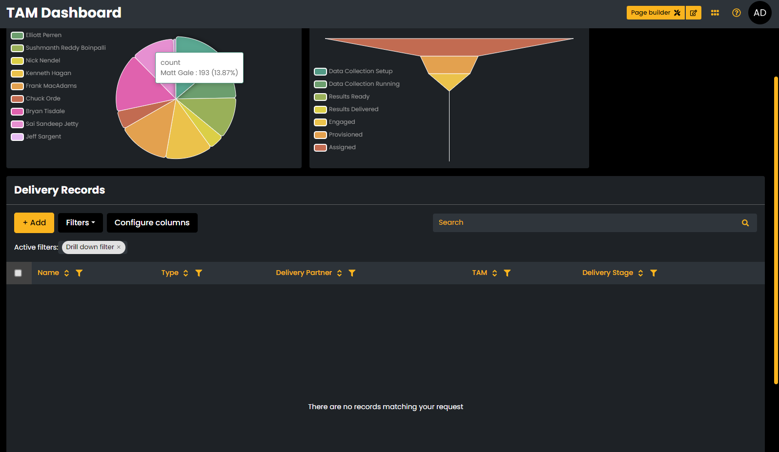
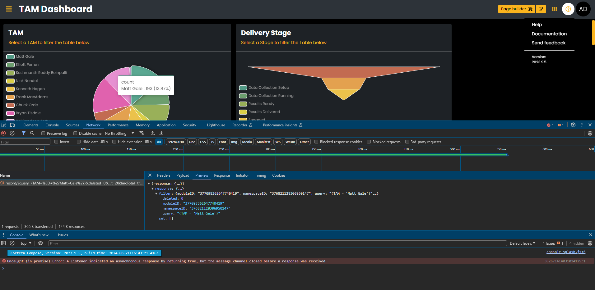
Hey! I love the idea of filtering a record list by clicking on an element of a chart - It’s a cool easy visual way to filter the list down. My challenge is that it doesn’t appear to be working as intended. Below are 2 screenshots. One with the unfiltered list, where you can see the “TAM” name of “Matt Gale” in the record list. The second screenshot shows what happens when I click “Matt Gale” from the pie chart above the list. A “Drilldown Filter” appears on the list, but no records are returned. Could this be a function of the TAM parameter being of type “Record Selector”?
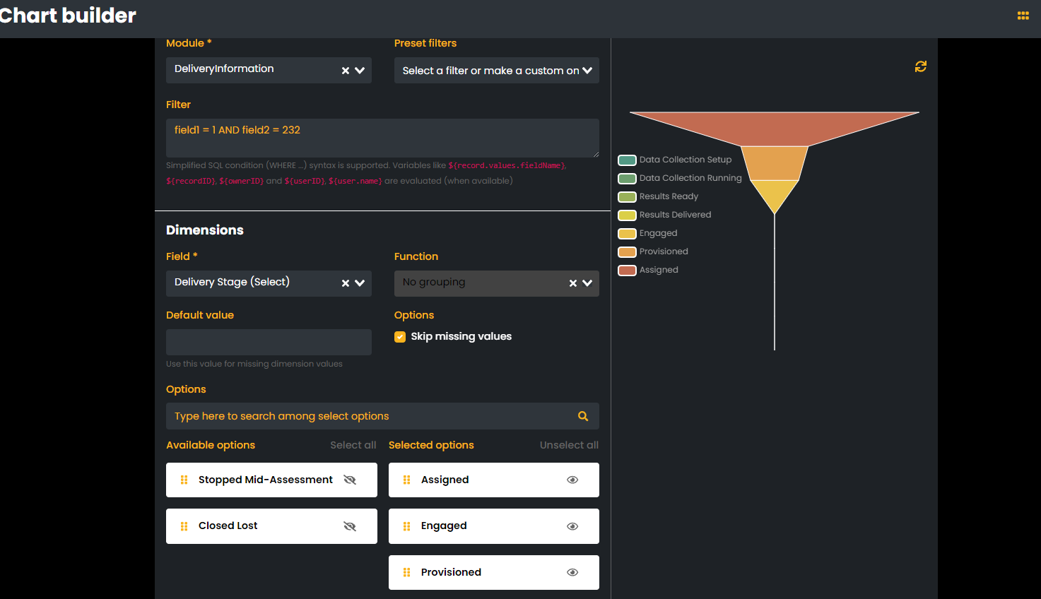
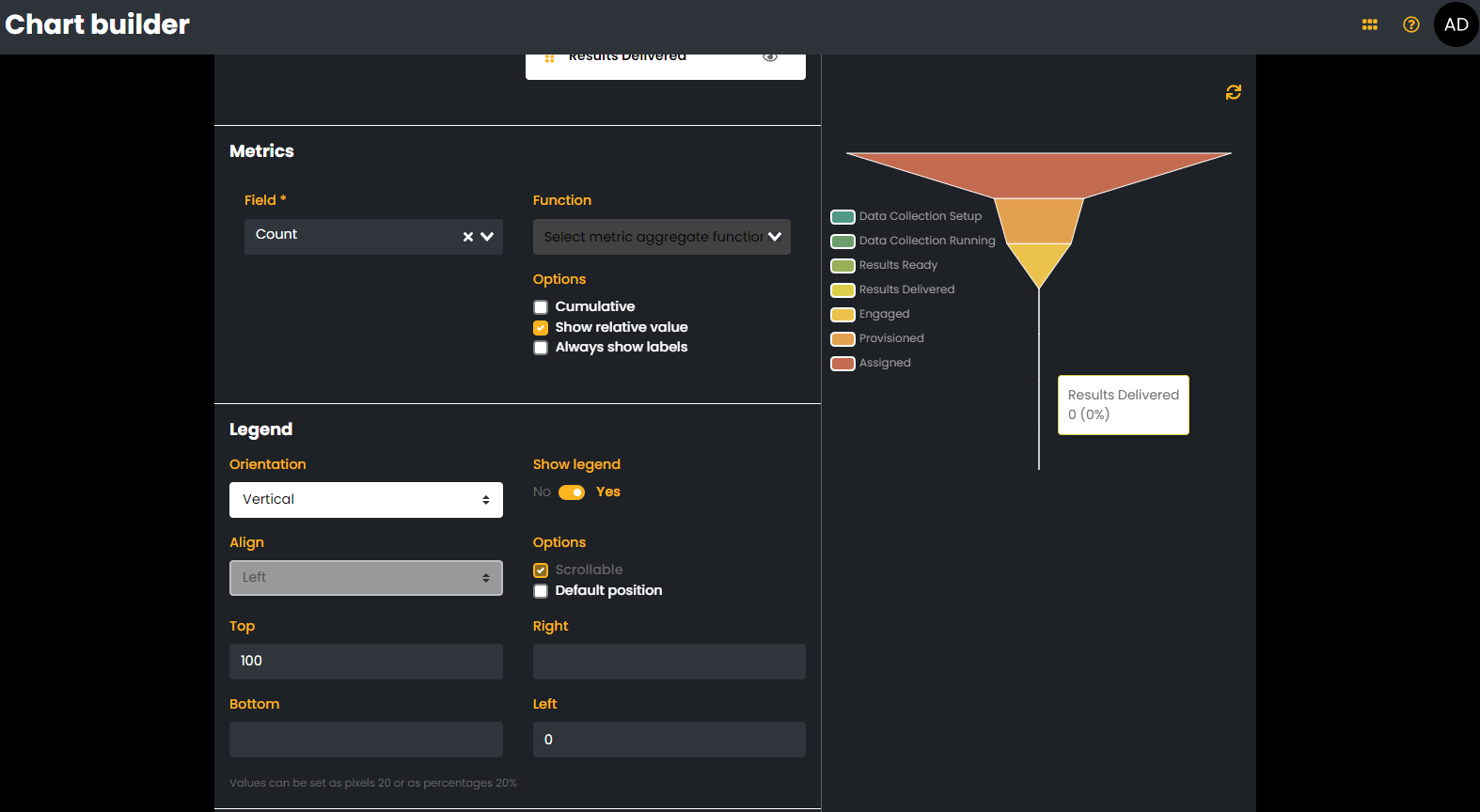
Also, you’ll note that the “Delivery Stage” funnel chart shows 0 records in the “Results Delivered” stage, but the first 2 records in the list are “Results Delivered”. The last 2 screenshots show the set-up for that chart. This seems to be less of a Chart-to-list relationship issue, and more of a chart set-up/data issue. But since it was nicely visualized by the screenshots, I thought I’d add it in.
I feel like I’m doing something silly in both of these cases…any help or guidance would be greatly appreciated!
Hmm interesting, yes it could be the record selector. I’ll take look today and try to recreate this.
Can you maybe try with a non record selector field? To see if that works.
Me again, first issue has been fixed on 2023.9.5 (since it was an actual bug with drilldown for select/record/user fields.
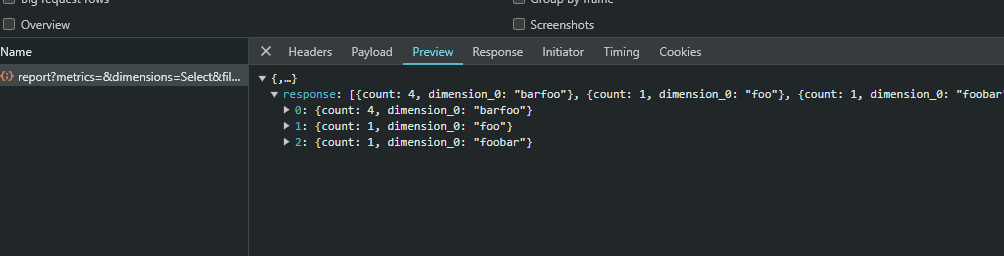
I couldn’t replicate the second one, one helpful thing is if you can provide the network tab request response (Right click, inspect, select the network tab, refresh the chart and click on the last request)
Hey @jfortun - Thanks again for a quick response here! See attached for a screenshot of the network request on the first issue. Also, confirming that we’re on 2023.9.5.
Any thoughts on how to troubleshoot the second issue? It’s not a record list issue, as it appears to be missing those stages in the chart builder…so I’m guessing it’s a data/filter issue.
@jfortun RE version Pathing - Got it! Sorry, I misunderstood. We just updated and that solved the problem! Works like a charm! Now that that’s working, my next question is around multiple charts that influence RecordLists. If you scroll up to my first post in this chain, you’ll see that we’ve got a couple of charts above the RecordList. It looks like clicking on one chart blows away the filter of the other chart. Is it possible for them to work in concert with each other? As an example, in my case I’d like to Select a user from the pie chart and then a delivery stage from the funnel chart, resulting in all records for that specific user and that specific stage. Apologies I’ve I’m asking for a unicorn here. I really like the ability to interact with the charts versus having to set a series of filters on the table
Currently that is not available but i will add it to the roadmap since it seems very useful.
It requires a small rework, and we’ll also show the actual filter instead of saying “Drill down filter”
That feature would be scheduled for a minor 2024.3 release
Can you describe how you see yourself using this feature? From a UI/UX standpoint.
When and how would the user decide what to do with the drilldown click?
I have a few ideas but more perspectives are always welcome
Hey @jfortun - Thanks for getting this into the development cycle! From a UI/UX perspective, it’s all about the ease of use and number of clicks. Having 2-4 nice visuals at the top of the dashboard enable the user to make single-click selections on each of the charts and watch the data in the recordList below automatically update. The alternative UX is to use the individual RecordList filters. which is double (if not triple) the number of clicks…especially when it comes to finding things in record selectors like contacts.
I love the idea of updating the “Drill down filter” to be more descriptive of what it’s actually doing. e.g. in our case, it would be great to read “TAM = {Contact Name}” or “Delivery Stage = {Stage}”.
The question then becomes, what happens if the user selects a different element in the chart. e.g. I first click “Matt” and then I click “Nick”. In that scenario I think it would be good to add the second selection to the RecordList as a separate Filter. That way the user can easily remove the one of the 2 selections.
Additional/Advanced things to consider
Dashboards can contain multiple recordLists. As-is, it looks like the chart only recognizes the first RecordList as an option. It would be very cool to be able to select Multiple recordLists to influence from that selection.
This may be a step too far But it would also be nice for the chart to visually indicate what element(s) are selected and influencing the record lists.
Please feel free to let me know if I can help answer any other questions or provide clarity on the above - very happy to help!