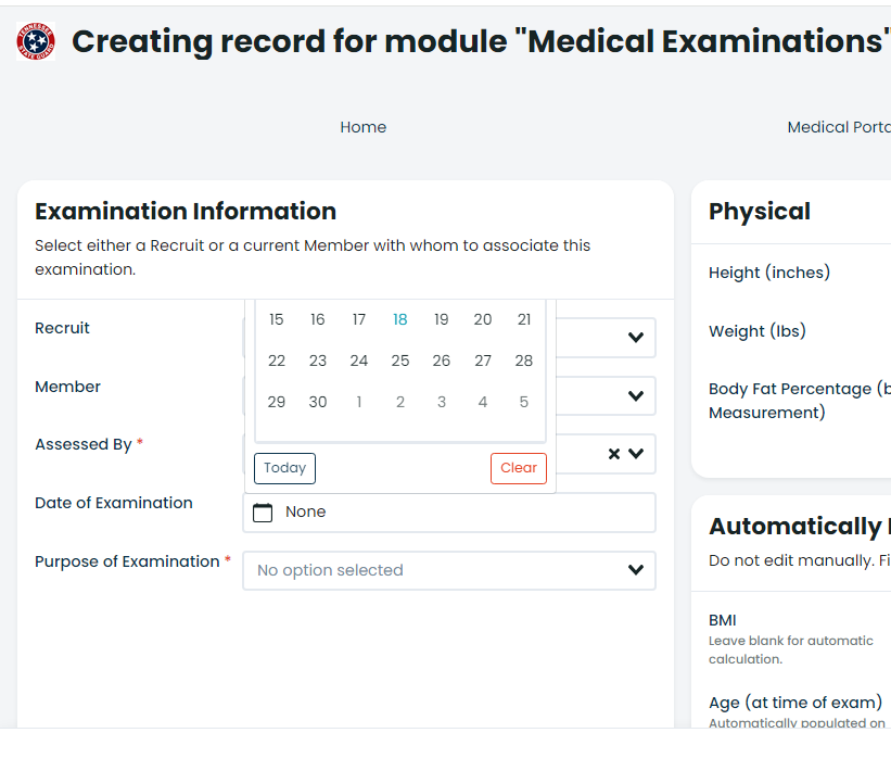
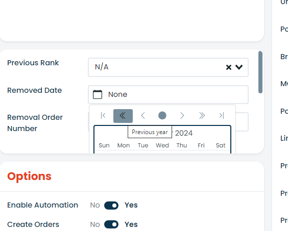
One of the annoying issues that my users have encountered pertains to the date picker. When a date field is selected and the calendar appears, it is contained within the boundaries of the block in which the field resides. Depending on the size of the block, it sometimes requires some creative scrolling to make the date picker usable.
In some instances, I’ve been able to mitigate this by increasing the size of the block, but that causes the block to take up more room on the page than is visually appealing.
If it’s technically feasible, you may want to find a way to make the date picker appear on top of everything, regardless of the boundaries of the block. This would eliminate the scrolling issue and allow the size of the block to be kept to the minimum required.