HI! Apologies if this is a silly question, I can’t find anything in the docs. How do we use the Stack field in the Metrics section of the Chart Builder? I’m trying to figure out how to slice my dataset (by a module field) and have it present as a stacked bar chart. Thank you!
1 Like
If you add multiple matrices to the report, the ones with the same value in that input will show as stacked.
For example:
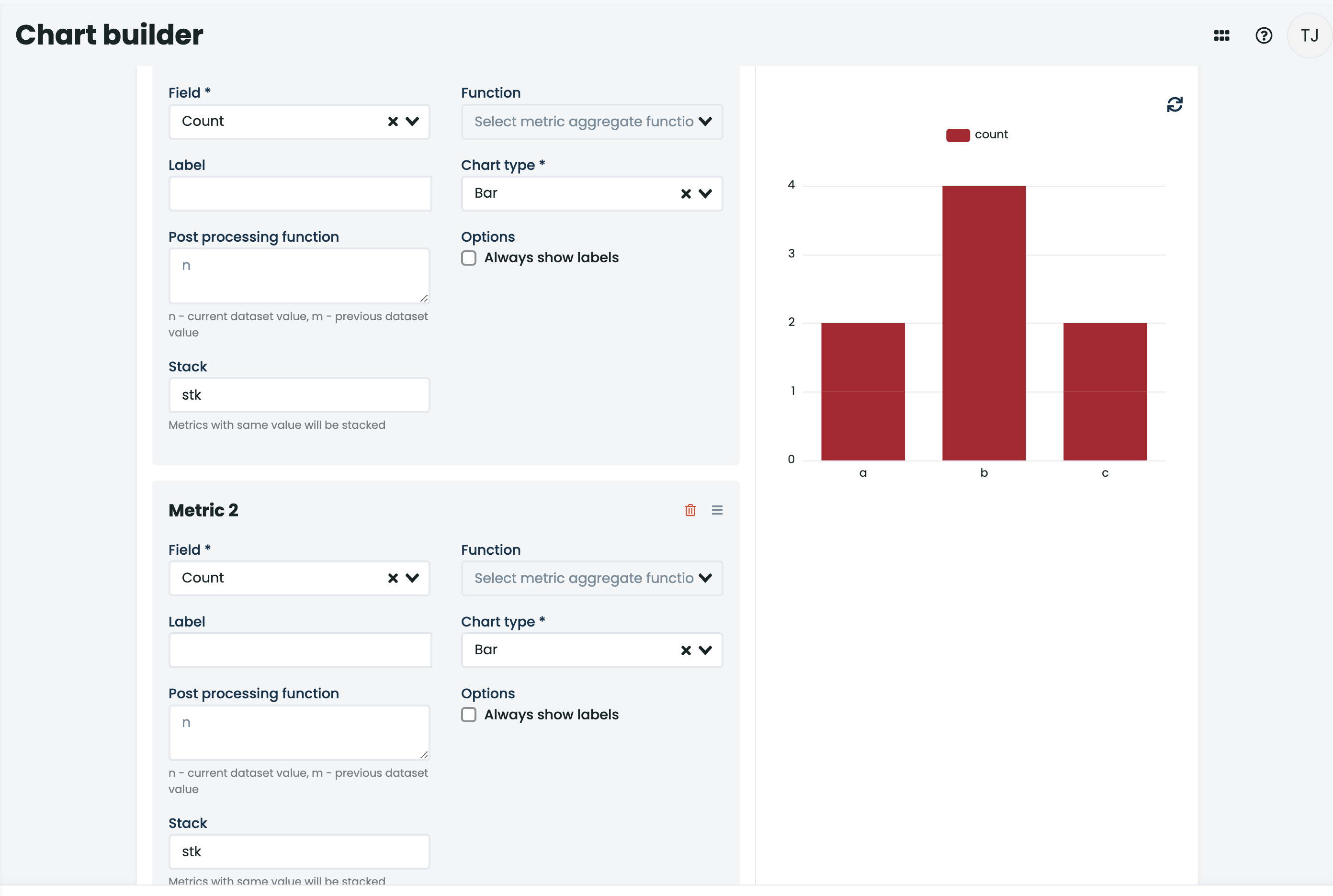
Before it was like so:
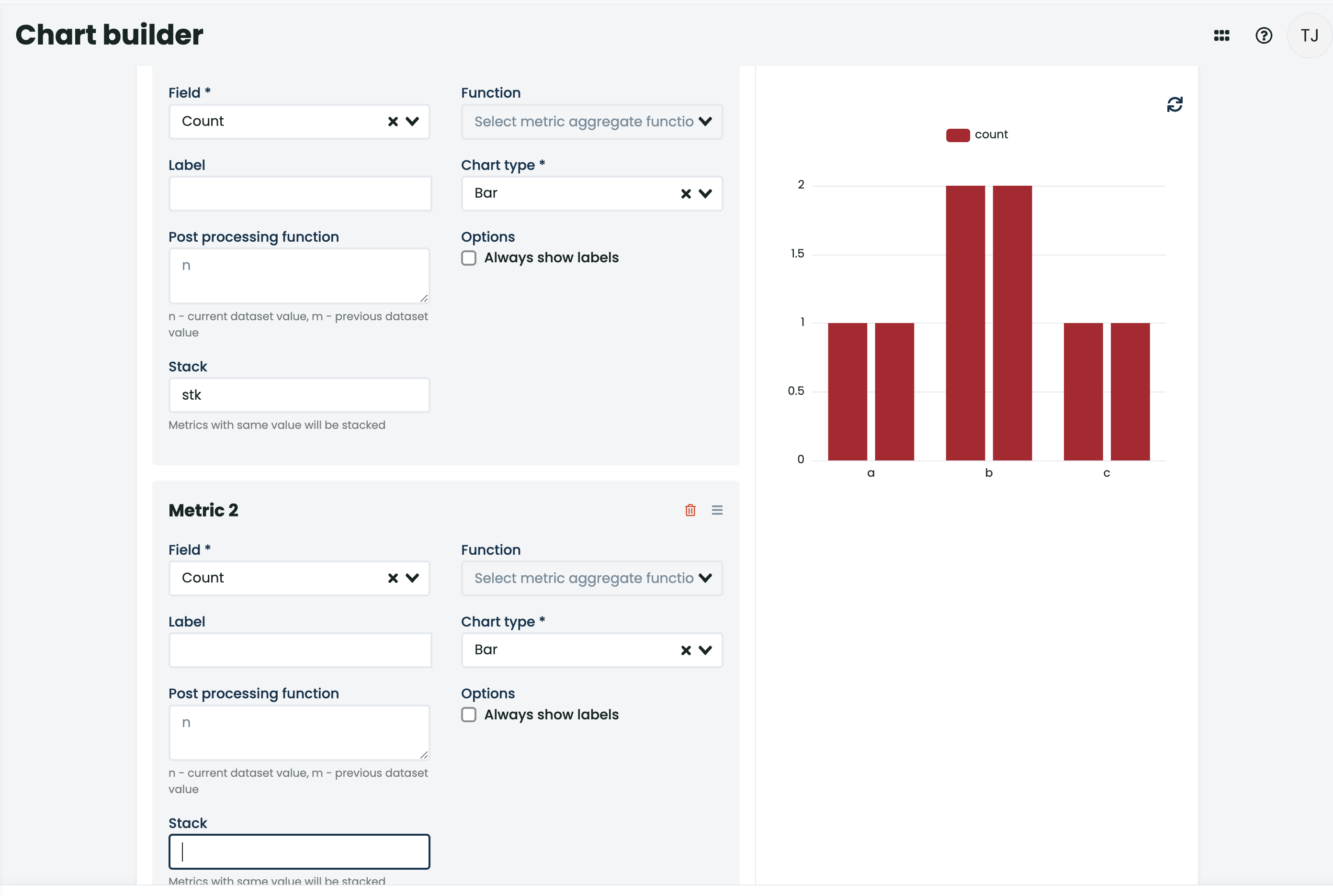
Notice the input and the value (ps this isn’t a good example but that’s all the data I had in there ![]() ).
).
Thanks for the quick & detailed reply @tjerman! Just to make sure I’m interpreting that example correctly, it’s not necessarily building a stacked bar chart, it’s really aggregating the 2 metrics into a single series on the chart? I was hoping there’d be a way to show them as 2 unique series stacked as a column, so you could see that metric A makes up X% of the column.
Like this yea?
I’m not entirely sure how it was done under the hood, but my example did have bar 1 above bar 2 (so like in the picture above).
Both bars had the same colour (not sure why) so it seems like it became one thing.
@jfortun do you have a hand to lend here?
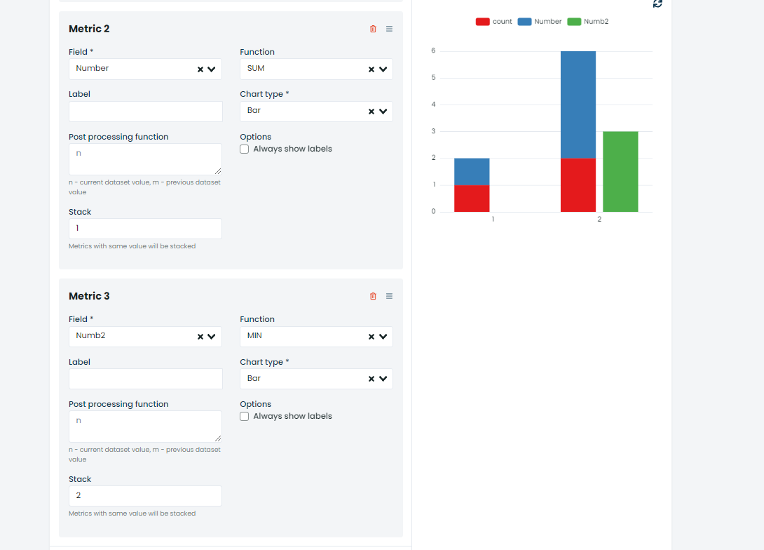
@tjerman’s example has only one color since his Metrics use the same field (Count), metrics that are identical are the same color.
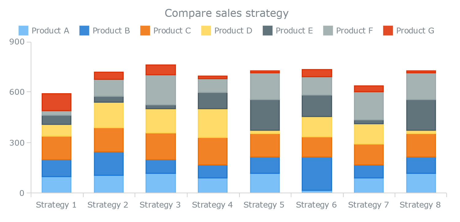
Below is an example with multiple unique metrics.
It shows each metric in its own color in the stack that is provided for that metric.
Stack is just a fancy name for the name of the group.
You can have multiple stack if you wish
1 Like
Ahh, yeah, that’s perfect. So it really doesn’t matter what you put in the stack field, it just has to be the same in each of the metrics that you’re looking to stack. Got it. Thank you both!
2 Likes
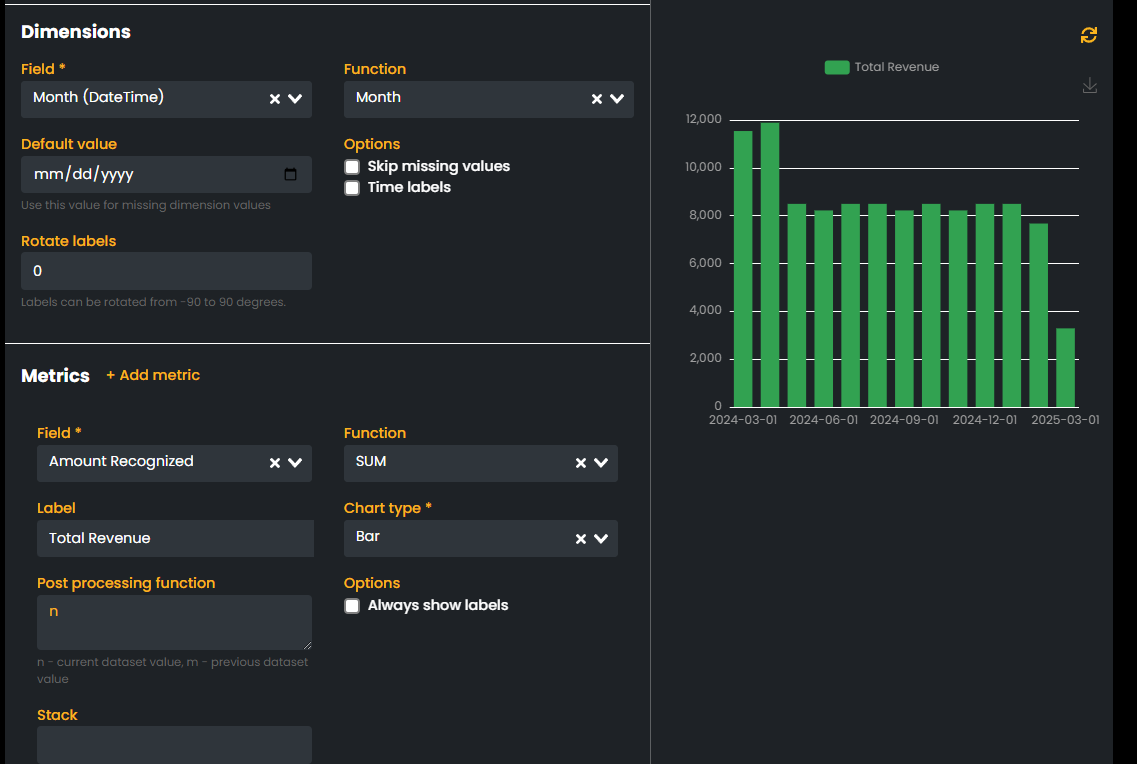
@jfortun - Thanks again for the response here. I’ve been trying to put this to use, but am struggling with achieving what I think should be possible in here. Here’s a simple example;
Module: RevRevLineItems
Field: ProductFamily (setting the field based on the product)
Field: AmountRecognized (Total amount of Revenue on the line)
Field: Month (the month the revenue lands in)
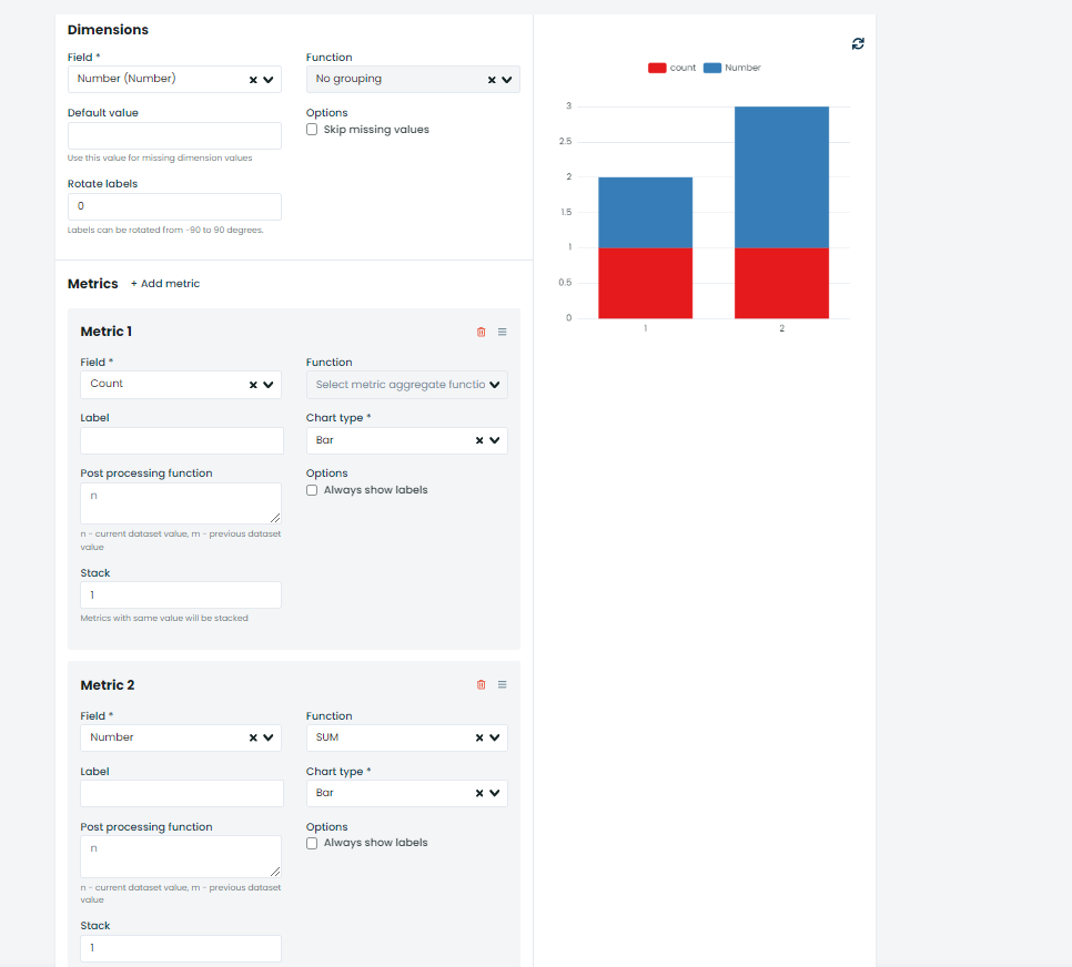
As is, I can sum all of the revenue in a given month and visualize that across the timeline, but what I can’t figure out is how to slice the AmountRecognized into multiple Metrics based on the ProductFamily. See attached screenshot for an example. I have a similar (but opposite ) challenge when trying to accomplish this in the reporting section, where I can aggregate and group things the way I want, but there doesn’t appear to be a stacking option there.
Am I seeking a magical unicorn here? Or just missing something? Thank you again!!
If i understand correctly you’d like to show the amount per month for each family.
Since that would be a second dimension (group), this cant be done on here.
You can however show this chart on a record page of the family and filter it based on it (by defining a filter in this chart like productFamily = ${recordID}
We should add a stack option in the reporter to satisfy this case, if you wish you can create a GitHub issue with that feature request.
1 Like